Updated October 2026. Searching for the best ai prompts for ui generation? Soft briefs like “make a modern landing page” burn credits and produce purple-gradient clones. Hard briefs name the audience, layout budget, tokens, states, and acceptance checks — then tools like v0, ChatGPT, Lovable, Cursor, or Stitch can actually invent a usable UI instead of a mood board.
This guide is a swipe file of prompt recipes by UI type: landing pages, dashboards, and settings screens, plus a consistency layer for design systems. You will get copy-paste blocks for v0 vercel prompt examples for ui, chatgpt prompts for landing page design, ai prompts to generate dashboard ui, and prompts for consistent ui design systems. For the brief framework behind every recipe, keep the Crisp-E prompt guide open. For product scaffolding around these screens, pair this with the 25 scaffold prompts and the afternoon walkthrough in how to vibe code a web app.
Voice check: Free Code Hustle / Mazhar Ali style — builder-first. Paste one recipe, click the happy path, tighten tokens, then ship the slice. Pretty comes after persistence and a stranger test.
Table of contents
- Why most AI UI prompts fail
- Crisp-E UI prompt anatomy (steal this skeleton)
- Recipe A — Landing page prompts (ChatGPT + v0)
- Recipe B — Dashboard UI prompts
- Recipe C — Settings / preferences screens
- Consistency layer — design system prompts
- Tool notes: v0, ChatGPT, Stitch, Figma handoff
- Acceptance checklist before you ship UI
- FAQ
- Soft CTA: paste one landing recipe today
Why most AI UI prompts fail
Generators are obedient, not tasteful. If you say “SaaS landing page, modern, clean,” you get the same hero, three feature cards, fake logos, and a pricing table you did not ask for. That is not a model failure — it is an underspecified brief.
Three failure modes show up every week:
- No layout budget. You did not cap sections, so the model invents seven of them.
- No token contract. Colors, type scale, radius, and spacing float per screen.
- No states. Empty, loading, error, and disabled never appear — so production UI looks broken the first time data is empty.
Hard prompts fix those before you open the canvas. Soft prompts waste a design day. If your goal is a thin vertical slice, treat UI generation like scaffolding: one job per paste, then verify.
Crisp-E UI prompt anatomy (steal this skeleton)
Every recipe below follows Crisp-E: Context, Role, Instruction, Specification, Performance, Example. For UI, map it like this:
- Context: product noun, audience, device (web/mobile), brand vibe in one sentence.
- Role: senior product designer who ships implementable layouts (not Dribbble art).
- Instruction: generate one screen / one flow — not an entire product.
- Specification: sections, components, tokens, copy constraints, non-goals.
- Performance: accessibility, contrast, mobile breakpoints, no inventing features.
- Example: acceptance checks a stranger can click without you narrating.
Paste the skeleton first when you invent your own recipes. Keep the Crisp-E post bookmarked when a brief starts drifting into essay mode.
CONTEXT: [Product] for [audience] on [web/mobile]. Brand: [3 adjectives]. Goal of this screen: [one job].
ROLE: Senior product designer who designs for implementation in React/Tailwind (or v0).
INSTRUCTION: Design [exactly N sections / one screen]. Do not invent extra pages.
SPECIFICATION:
- Layout: [grid / stack / sidebar]
- Components: [list]
- Tokens: primary [#hex], bg [#hex], text [#hex], radius [Npx], spacing base [N]
- Copy: [tone]; max headline [N] words
- States: default, hover, empty, loading, error
- Non-goals: [payments, chatbots, dark mode toggle, marketing fluff]
PERFORMANCE: WCAG AA contrast. Mobile-first. No stock illustration spam. No fake metrics unless labeled demo.
EXAMPLE: After render, a stranger can [3 clickable acceptance checks].
Recipe A — Landing page prompts (ChatGPT + v0)
Landing pages fail when you ask for “everything.” Cap sections. Name the CTA. Ban fake social proof unless you have real logos. These chatgpt prompts for landing page design and v0 vercel prompt examples for ui keep the generator honest.
A1. ChatGPT — Crisp landing brief (tighten before you generate)
You are helping me write chatgpt prompts for landing page design.
Turn this messy idea into a Crisp-E brief under 220 words for a single marketing landing page:
Idea: [paste]
Audience: [who]
Primary CTA: [verb + object]
Must-have sections (max 5): [list]
Must-not sections: pricing table / blog / chatbot / fake logos
Tokens: [primary, bg, text, radius]
Output: paste-ready brief only. No essay.
A2. v0 — Hero + proof + CTA (copy-paste)
Build a single Next.js + Tailwind landing page for [Product] that helps [audience] [outcome].

Sections (exactly 4):
1) Sticky nav: logo text, 2 links (Features, FAQ), primary CTA button
2) Hero: headline (max 10 words), subhead (max 24 words), primary CTA, secondary ghost CTA, right-side product screenshot placeholder
3) Features: 3 cards, icon + title + 2-line body — no more than 3
4) Final CTA band + minimal footer (copyright + 2 links)

Design tokens:
- Primary: #0F766E, background #F8FAFC, text #0F172A, muted #64748B
- Radius 12px, shadow soft, Inter-like sans
- High contrast; avoid purple gradients and glassmorphism

Copy tone: direct, founder-to-founder, no hype adjectives.
Non-goals: pricing, testimonials carousel, blog, chatbot, dark mode.
Acceptance: CTA always visible on mobile; hero fits above fold on 1280px; feature cards stack on mobile.
Use shadcn/ui primitives where natural. Do not invent extra routes.
A3. ChatGPT — Landing critique pass (after first draft)
Critique this landing page structure as a conversion-focused designer:
[paste section list + headlines]
Score clarity, CTA strength, and trust (1-5 each).
Rewrite only the headline, subhead, and primary CTA.
List 3 cuts that remove fluff without losing the offer.
Do not redesign the whole page.
A4. v0 — Variant: waitlist landing (tight)
Single-page waitlist landing for [Product].
Sections: nav, hero with email capture (email + Join waitlist), 3 benefit bullets, FAQ accordion (4 items), footer.
Show success state after submit: "You're on the list — check email."
No fake user counts. No social login. Tokens: [paste]. Mobile-first.
When the landing looks good enough to click, stop decorating. Wire the CTA to a real form or waitlist endpoint in your scaffold — see the scaffold pack for persistence prompts.
Recipe B — Dashboard UI prompts
AI prompts to generate dashboard ui go wrong when they invent charts before they invent the entity. Start with the primary object (invoices, tasks, campaigns), then metrics that serve that object. Ban decorative sparklines you cannot explain.
B1. Dashboard information architecture (ChatGPT)
Act as a product designer for a B2B dashboard.
Entity: [Invoice / Task / Campaign]
User job: [job-to-be-done]
Propose exactly:
- 1 primary list view
- 4 KPI cards max (name + definition + empty-state text)
- 3 filters
- 1 empty state CTA
Ban: world maps, fake realtime graphs, chat widgets, dark theme unless requested.
Output as a bullet IA I can paste into v0.
B2. v0 — Operational dashboard (copy-paste)
Build a web dashboard for [App] where [user] manages [entities].

Layout:
- Left sidebar (collapsible on mobile): Overview, [Entities], Settings
- Top bar: page title, search, user avatar menu
- Main: 4 KPI cards in a row, then a data table of [entities]

Table columns: [Name], [Status], [Updated], [Owner], actions (View, Edit)
Filters above table: status select, date range, search
States required:
- Loading skeleton for KPIs + table
- Empty state with illustration placeholder + "Create first [entity]" button
- Error banner with retry

Tokens: primary #2563EB, bg #FFFFFF, surface #F1F5F9, text #0F172A, radius 10px
UI: shadcn/ui + Tailwind. Dense but readable. No purple SaaS cliche.
Non-goals: billing, team invites, activity feed, chat.
Acceptance: create button visible when empty; table sorts by Updated; sidebar highlights active route.
B3. Cursor / ChatGPT — Metric honesty pass
Review these dashboard KPIs: [list]
For each: define formula in plain English, say what "good" looks like, and write empty-state copy.
If a KPI cannot be computed from [fields], mark DELETE.
Do not invent new charts.
B4. Dashboard detail drawer (v0)
Add a right-side drawer for [entity] detail opened from the table row.
Sections in drawer: header (name + status badge), key fields, activity list (max 5), primary action button, secondary danger action.
Include loading and not-found states.
Do not create a separate full page. Keep the table underneath.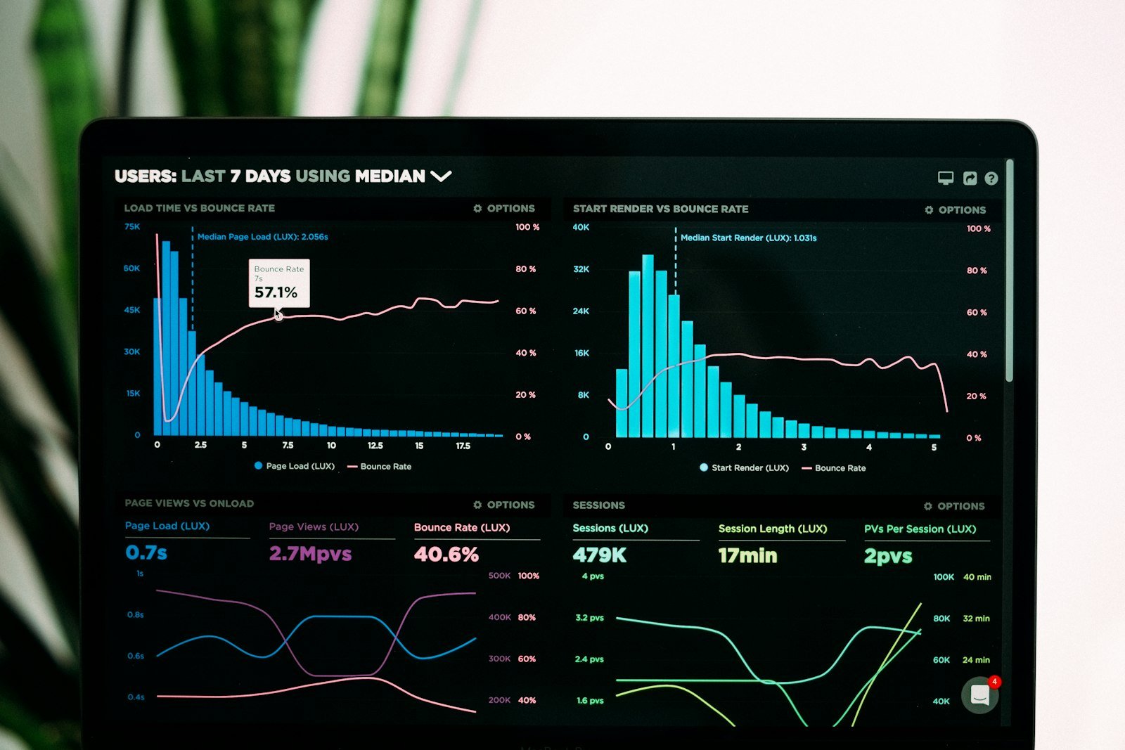
Recipe C — Settings / preferences screens
Settings UIs look “easy” and then grow into a junk drawer. Prompt for groups, not infinite toggles. Every control needs a label, helper text, default, and save behavior.
C1. Settings IA (ChatGPT)
Design a settings information architecture for [App].
User: [solo founder / team admin]
Must include: Profile, Notifications, [Domain-specific], Danger zone
Max 4 tabs/sections. Max 8 controls total across all sections.
For each control: type (text/toggle/select), default, helper text (max 12 words), validation rule.
Non-goals: SSO, audit log, billing portal (unless named).
Output a table I can implement.
C2. v0 — Settings page (copy-paste)
Build a Settings page with vertical tabs (Profile, Notifications, Preferences, Danger zone).

Profile: name, email (read-only + change email CTA), avatar upload placeholder
Notifications: 3 toggles with helper text (product tips, weekly digest, security alerts)
Preferences: theme select (System/Light/Dark), density select (Comfortable/Compact)
Danger zone: delete account button opening confirm dialog (type DELETE)

Behavior:
- Save button sticky on desktop; disabled until dirty
- Toast on successful save
- Inline validation on email change CTA (stub)
- Confirm dialog traps focus

Tokens: match existing app primary [#hex]; surfaces #F8FAFC; destructive #DC2626
Accessibility: labels tied to inputs; toggles keyboard operable; dialog Escape closes
Non-goals: billing, API keys, webhooks, team roles
Acceptance: dirty-state enable/disable works; Danger dialog requires typing DELETE; mobile tabs become a select.
C3. Surgical fix prompt (any tool)
Bug on Settings: [exact UI text]
Steps: [1-2-3]
Expected: [result]
Actual: [result]
Fix only the Settings form behavior. Do not restyle the app. Do not touch Dashboard.
Tell me the 3 clicks to verify.
Settings are where token waste hides — models love adding “Integrations” and “Developer” tabs you never asked for. Keep the non-goals line sacred.
Consistency layer — design system prompts
One-off pretty screens are cheap. A coherent product is not. Use these prompts for consistent ui design systems after you like Recipe A/B/C individually — otherwise you lock in bad defaults.
D1. Token contract (ChatGPT → paste into every later prompt)
Create a minimal design token contract for [App]:
- Color: primary, primary-foreground, background, surface, muted, border, destructive, success
- Type: display, h1, h2, body, small (size + weight + line-height)
- Spacing: 4/8/12/16/24/32
- Radius: sm/md/lg
- Shadow: none/sm/md
- Motion: duration fast/base (ms) + easing
Return as a compact markdown block I can paste into v0/Cursor/Stitch prompts.
No optional tokens. No gradients.
D2. Component inventory prompt
From these screens [Landing, Dashboard, Settings], list the shared components we must standardize first (Button, Input, Badge, Card, Table, Tabs, Toast, Dialog).
For each: variants needed, do/don't, and one accessibility note.
Cap at 8 components. Output as a checklist.
D3. Cross-screen consistency audit
Compare Landing vs Dashboard vs Settings against this token contract: [paste]
List mismatches in color, radius, spacing, and button hierarchy.
Propose the smallest patch prompt per screen (max 3 bullets each).
Do not redesign from scratch.
When motion enters the picture — hover, drawer, dialog — define durations in the token contract, then hand off cleanly. Use Figma Smart Animate for prototype intent and Figma motion handoff for developers so engineers do not guess 300ms vs 180ms.
Tool notes: v0, ChatGPT, Stitch, Figma handoff
ChatGPT is best as a brief sharpener and critic — not as your only renderer. Use it to produce Crisp-E briefs and cut fluff, then paste into a UI generator.
v0 (Vercel) shines when you give tokens, component names, and acceptance checks. The v0 vercel prompt examples for ui above assume shadcn/Tailwind; say so explicitly. Ask for one route at a time.
Stitch (Google Labs) is strong for multi-screen ideation before you commit to code. Read the honest take in our Google Stitch AI review: great for drafts, not a replacement for a production design system.
Figma still owns systems, shared components, and motion specs. Generate → paste/import → tighten components → hand off. Do not pretend a generator export is a design system.
If you are wiring these screens into a working app the same afternoon, stay inside the loop from how to vibe code a web app: scaffold, click the path, then decorate.
Acceptance checklist before you ship UI
- One primary job per screen is obvious in 3 seconds.
- Empty, loading, and error states exist for every data view.
- Primary CTA contrast passes AA; focus rings visible.
- Tokens match across Landing, Dashboard, Settings (color, radius, spacing).
- No sections you did not request (pricing, chat, fake logos).
- Mobile: nav usable, tables scroll or stack, settings tabs become selectable.
- Copy uses your product nouns — not “items” and “entities” unless those are real.
- Motion (if any) has named durations ready for handoff.
Fail any two of these and you are still in ideation. Keep generating. Do not ship the costume.
FAQ
What are the best AI prompts for UI generation in 2026?
The best ones name audience, layout budget, tokens, states, and acceptance checks — then ban extras. Soft “make it modern” prompts are obsolete. Use the Crisp-E skeleton and the landing/dashboard/settings recipes above.
Should I write UI prompts in ChatGPT or directly in v0?
Both. ChatGPT tightens the brief; v0 (or Stitch/Lovable) renders. Pasting a fuzzy paragraph into v0 wastes generations. Pasting a Crisp-E brief usually gets you something clickable on try one or two.
How do I keep AI-generated screens consistent?
Freeze a token contract early (Recipe D1) and paste it into every subsequent prompt. Run a cross-screen audit before you build components. Consistency is a prompt habit, not a luck streak.
Can AI replace Figma for production UI?
For ideation and first drafts, often yes. For production systems, shared components, and motion handoff, Figma (or equivalent) still wins — as covered in the Stitch review and motion handoff guides linked above.
Where do landing, dashboard, and settings fit in a vibe coding day?
After scaffold and a working happy path. UI polish on top of empty persistence is how demos die. Use the scaffold prompts first, then these UI recipes.
Soft CTA: paste one landing recipe today
Pick Recipe A2. Replace bracketed nouns with your product. Paste into v0 (or your generator of choice). Click the CTA on mobile. If the model invents a pricing table, delete it with a surgical follow-up — do not regenerate the universe.
Then lock tokens with Recipe D1 and generate the dashboard empty state before you invent charts. When you need the brief framework, return to Crisp-E. When you need the build loop, open how to vibe code a web app and the scaffold starter pack. Cleaner UI is not a nicer model — it is a harder prompt.